Most B2B companies track organic search with Google Analytics and Search Console to report on rankings, traffic, and impressions. The problem is that none of those metrics answer the question CEOs are actually asking: is SEO making us money?
The data to answer that question usually exists in your CRM already. It’s just not connected to your SEO reporting. This post walks through how to build a simple HubSpot dashboard that ties organic search to leads, pipeline, and revenue. Four widgets, about 20 minutes of setup, and you’ll have a report that actually means something to the C-suite.
What You Need Before You Start
HubSpot tracking code firing site-wide. If the tracking code isn’t on every page, HubSpot can’t attribute contacts to organic search. Check your site’s source code or use the HubSpot browser extension to confirm.
Original Source populating on new contacts. Pull up 5 recent contacts in your CRM and check the “Original Source” property. If it says “Organic Search” for people who came through Google, you’re good. If it’s blank or showing “Direct Traffic” for everyone, something is broken in your tracking setup.
Internal team emails identified. You’ll want to exclude your own team from the data. Know your client’s email domain so you can filter out internal contacts.
For the pipeline widget: Marketing Hub Pro+ and active Deals. The first three widgets work on any HubSpot tier. The pipeline widget (the most important one) requires Professional or Enterprise and needs your team to actually be creating and updating deals in HubSpot. If you’re not tracking deals yet, build the first three widgets now and add the fourth once deal data is flowing.
Every widget in this dashboard uses the same two filters:
- Original Source is equal to Organic Search — this isolates only the contacts who found you organically through Google or other search engines.
- Email does not contain @yourcompany.com — this excludes internal contacts from the numbers.
Apply both of these to every report you build. If your client has multiple internal email domains, add each one as an exclusion.
One important note: use “Original Source,” not “Latest Source.” Original Source captures first-touch attribution, meaning it credits the channel that first brought the contact to your site. Latest Source would re-attribute contacts every time they return through a different channel.
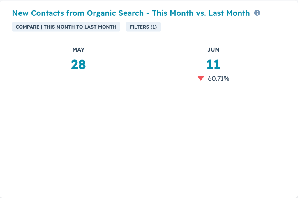
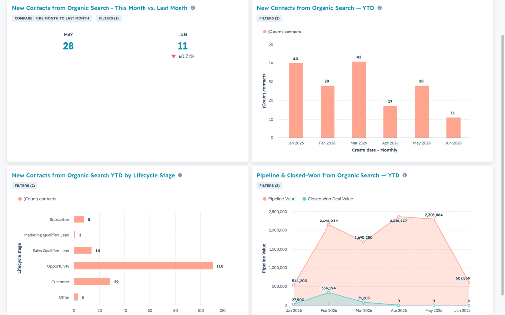
Widget 1: This Month vs. Last Month
What it answers: How is this month performing so far?
This is the simplest widget on the dashboard and the first thing anyone will look at. Build it as a Single Value (Summary) report on the Contacts object. Filter to your standard filter set plus “Create date is this month.” Set the comparison to “previous period (last month).”
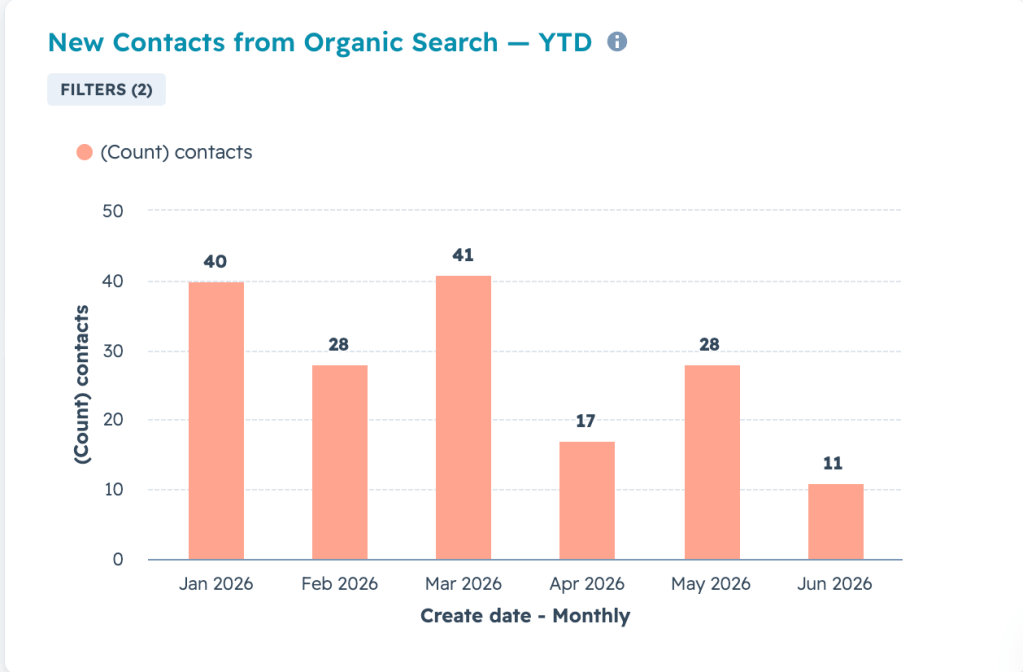
Widget 2: Year Trend Line
What it answers: Are we growing new inbound contacts over time?
Build this as a vertical bar chart on the Contacts object. Filter to your standard filter set plus “Create date is this year so far” Group the X-axis by month.
This chart shows the compounding impact of SEO over the course of the year, and can be expanded based on the duration of your SEO engagement.
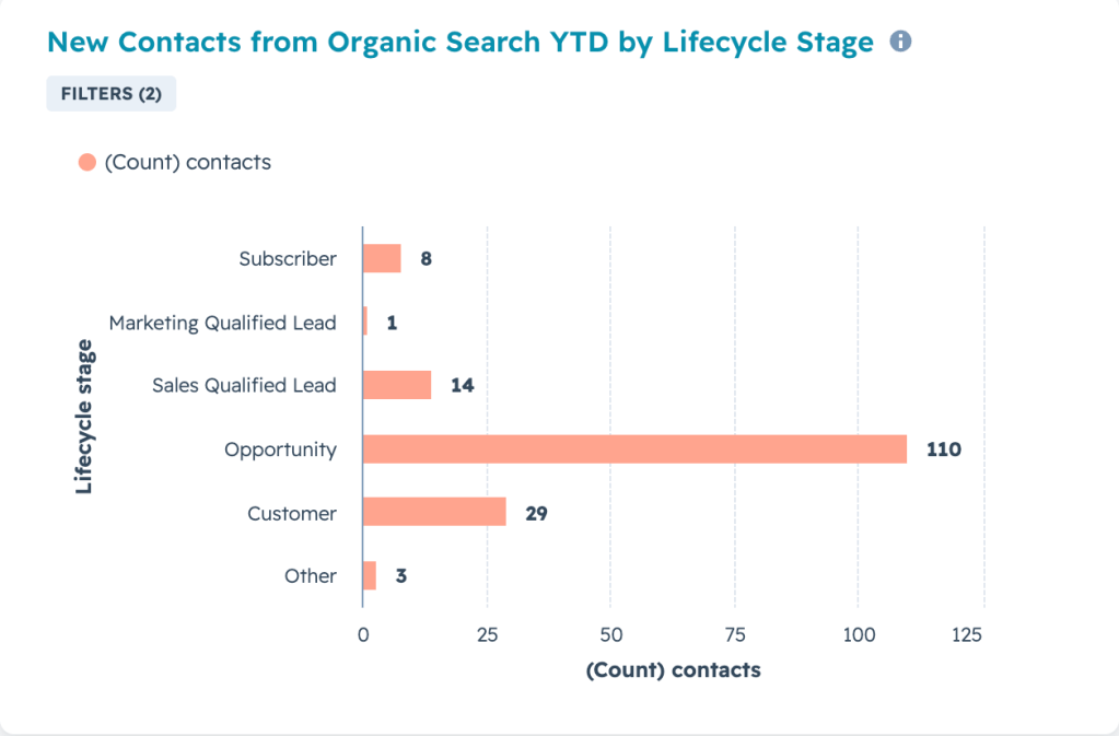
Widget 3: Lifecycle Stage Breakdown
What it answers: Are organic leads actually any good, or just volume?
This is where the report starts to separate itself from a basic traffic dashboard. Build it as a horizontal bar chart on the Contacts object, broken down by Lifecycle Stage. Filter to your standard set plus “Create date is year to date.”
The stages should flow in order: Lead → MQL → SQL → Opportunity → Customer (may vary if using custom Lifecycle Stages).
What you’re looking for is how far organic leads progress through the funnel. If organic drives 100 leads but only 2 ever become opportunities, you know the traffic is attracting the wrong audience. If organic leads convert to opportunities at a higher rate than paid or outbound, that’s a powerful data point to inform your overall marketing strategy.
If your team isn’t using lifecycle stages yet: Don’t leave an empty widget on the dashboard. Swap this for an “Organic vs. All Other Sources” stacked bar showing this month’s leads by Original Source. It gives you share-of-pie context instead of a broken funnel.
Widget 4: Pipeline and Closed-Won from Organic
What it answers: How much revenue is SEO actually generating?
This is the widget that gets SEO budgets renewed. Use the Custom Report Builder with a cross-object report on Contacts + Deals. Apply your standard contact filters. For the deal side, filter to “Deal Create Date is year to date.” Set up the chart as an area chart: first line showing total pipeline dollars by month, with the second line overlay showing closed-won dollars. Group the X-axis by Deal Create Date, monthly.
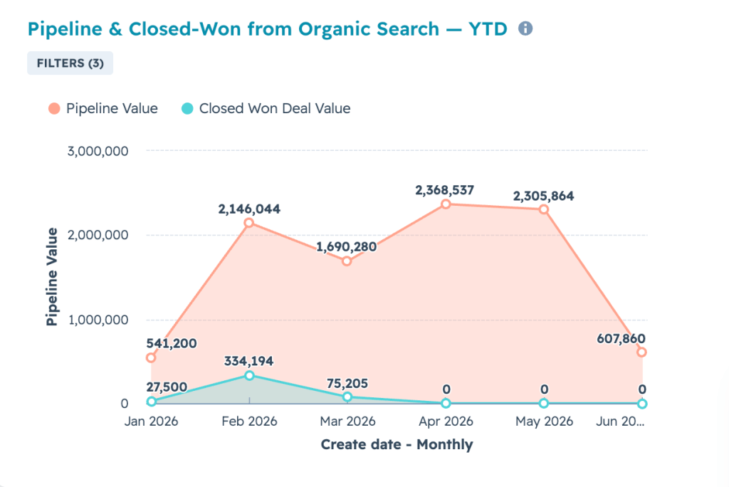
One thing to flag clearly on the dashboard (add it to the description): these numbers reflect deals associated with contacts whose Original Source was Organic Search. That’s first-touch attribution. A deal gets counted in the month it was created, not the month the contact first visited the site. This context is important to avoid confusion when discussing revenue.
The Final Layout
The visual flow is intentional. Volume, then trend, then quality, then dollars. Each row answers the next question the viewer is going to ask. “How many leads?” leads to “is that more than before?” leads to “are they any good?” leads to “how much are they worth?”
Set Up Monthly Report Email
Don’t make people log into HubSpot to see this. Schedule a recurring email.
Go to Dashboard → Actions → Schedule recurring email. Set it to monthly, on the 1st of the month at 9 AM. This ensures the previous month is fully closed before the report goes out. Send it to your SEO team, the client stakeholder, and whoever manages the relationship.
Common Mistakes to Avoid
Using Latest Source instead of Original Source. This is the most common mistake. Latest Source re-attributes contacts every time they come back through a different channel. A contact who found you through organic search, then clicked an email link, then came back through a bookmark gets attributed to whatever their most recent visit was. Original Source preserves the first-touch credit.
Leaving empty widgets on the dashboard. If the client isn’t using lifecycle stages, don’t show a lifecycle widget with no data. If they don’t have deals in HubSpot yet, don’t show a pipeline widget with zeros. Empty widgets erode trust in the dashboard and make people stop looking at it.
Deals not associated with contacts. Widget 4 depends on contact-to-deal associations in HubSpot. If your sales team creates deals manually without linking them to a contact record, the pipeline data will look artificially low. Audit 10 recent deals to make sure the associations are flowing. If they’re not, that’s a CRM hygiene fix that needs to happen before the dashboard is reliable.
Internal contacts inflating the numbers. The email domain filter catches most internal traffic, but employees sometimes fill out forms with personal email addresses. Periodically check the contact list for suspicious patterns, especially around launch dates when the team is testing forms.
What This Dashboard Doesn’t Do (And What Comes Next)
This is a first-touch attribution dashboard. It tells you which contacts and deals started with organic search. It doesn’t capture multi-touch influence, like situations where a contact found you through paid search but read five blog posts before converting.
Once this dashboard is running and the team is comfortable with the data, the natural next steps are adding multi-touch attribution modeling, breaking down pipeline by specific landing page or content cluster, and comparing organic CAC against paid and outbound CAC. But start here. A working first-touch pipeline dashboard puts you ahead of 90% of B2B companies reporting on SEO.
SEO reporting in B2B is broken because most teams report on traffic and rankings instead of pipeline and revenue. This dashboard is how you fix it. Twenty minutes of setup, four widgets, and you have a report that connects organic search to the numbers your business actually cares about.

Leave a comment